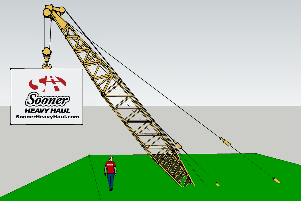
I created these ideas in Google SketchUp for Sooner Heavy Haul and the client loved them.
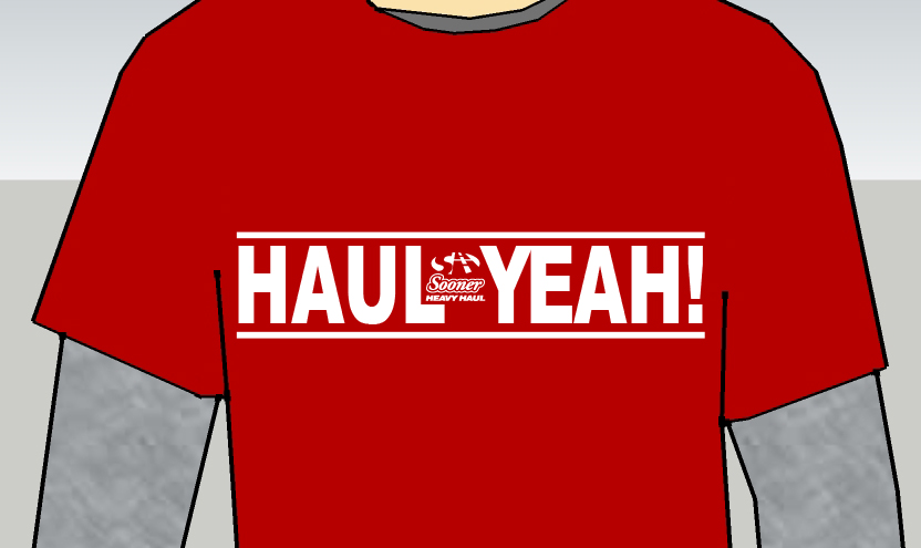
The tagline Haul Yeah!™ was created once
I started on the exterior concept signs.
I rebranded their logo too. The red dot is fitting, since the company was going into a new direction – BIGGER equipment for heavy hauling.
The double “H” creates a visual illusion of depth
and a highway to broaden their horizons for both
company future goals and clients.
To continue with a new look, the website was
completed: soonerheavyhaul.com and incorporated the logo for hard hat stickers and vehicle identification.


After presenting Haul Yeah! as a tagline, the client had to have new T-shirts only two months since the last order!
Copyright © 2015 Cailler Enterprise, Inc.