
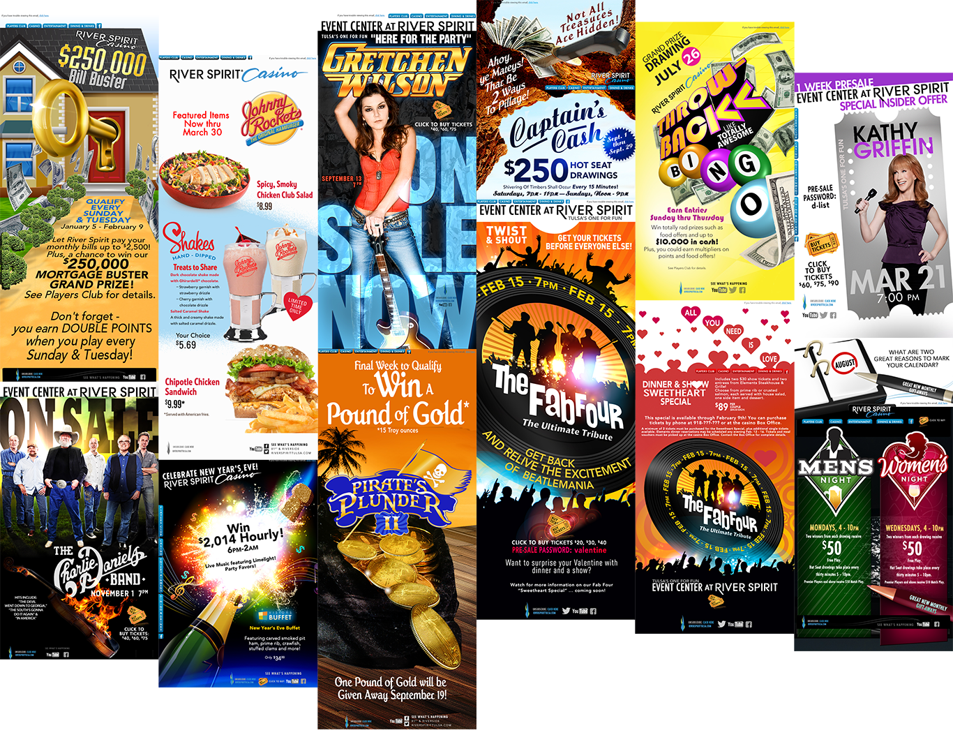
Email blasts featuring upcoming promotions and attractions at River Spirit Casino
Email blasts featuring upcoming promotions and attractions at River Spirit Casino
This fun Route 66 celebration of the Blue Whale makes you smile.
Created for the young and young at heart is the stylized design for the attraction
located in America’s heartland Catoosa, OK.

Blue Whale T-shirt design by Shelly Cailler
Final Stationary and Logo Presentation –
Legend™ A Cut Above The Rest
______________________________________________________________________________

Below is the copy I wrote as a reminder of who my client is and what they want:
Adventurers like us will walk miles for the right crystal stream with a light cool breeze behind us and want the right rugged clothes on our backs – comfort is a luxury in wide open spaces – from Legend’s Sun-blocking Hat™, that wicks away sweat from our brow to Legend’s Hi-Pro Waders™ that keep us dry and wanting to go the distance – beyond the reach of the brook. The love of Fly Fishing goes beyond the goal to win, it is the elements of the sport – a rod and reel, fly and steel. Our hearts race to catch the rush.
It is just you against the flow – rhythm and timing, wading and waiting for the thrill of the strike on your line.
We are practiced and patient. We are perfection. We want quality. We want the catch of a lifetime – to tell the tale with fellow Fly Fishers around the kindling warm-glow of the fireplace after a beautiful bountiful day.
At Legend™, we offer Fly Fishers with quality comfort outerwear to fit the adventure.
Design:
____________________________________________________________________________
 Of the four logos presented, the client prefers the first one on the top left. The font and logo icon meet the initial criteria and demographics as outlined.
The logo for Legend™ embodies the main staple of every Fly Fisherman’s adventure – the fish. Because many species of fish are different sizes, a silhouette for the fish is desirable.
The imagery for the ads will feature different species and settings. The color palette for the ads should be fully saturated Earth tones with sepia tones behind the logo. The merchandise will provide the “spot color” and focal point.
The Legend™ logo, whenever possible, needs to include materials such a metals, this way the brand is galvanized in the truest tradition of Legend™.
If white is the main color of the logo, we prefer a pearl to capture the salmon color on a trout. This treatment will be for specialty items only, like our signature pocket knife with a pearl inlay handle.
Foiling for stationary is also preferred, which will provide a sharp contrast to matte finishes for business cards and glossy catalogs.
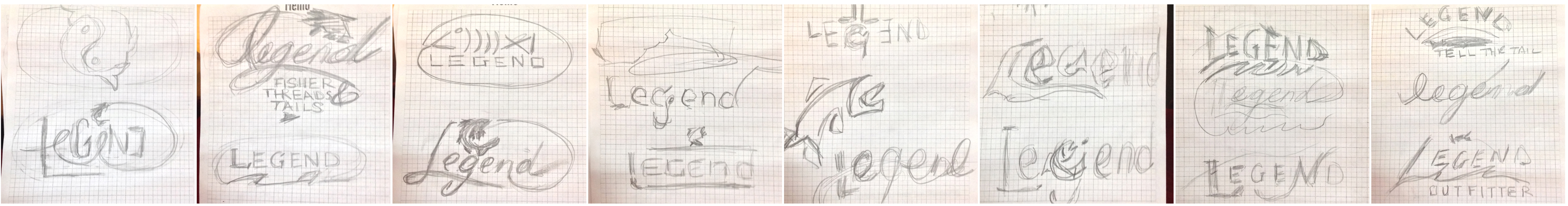
Sketches and Benchmarking
______________________________________________________________________________
Below are the ideas for type placement and visual weight and balance. From Google search,
Orvis logo and color palette. With this example, the direction
was decisive to go with a clean typeface and silhouette of a fish.

This is a continuous loop for in department store kiosk point of sale for CVS/pharmacy.

Production open for ESPN Regional affiliates. I wanted to play off scale and proportion.
